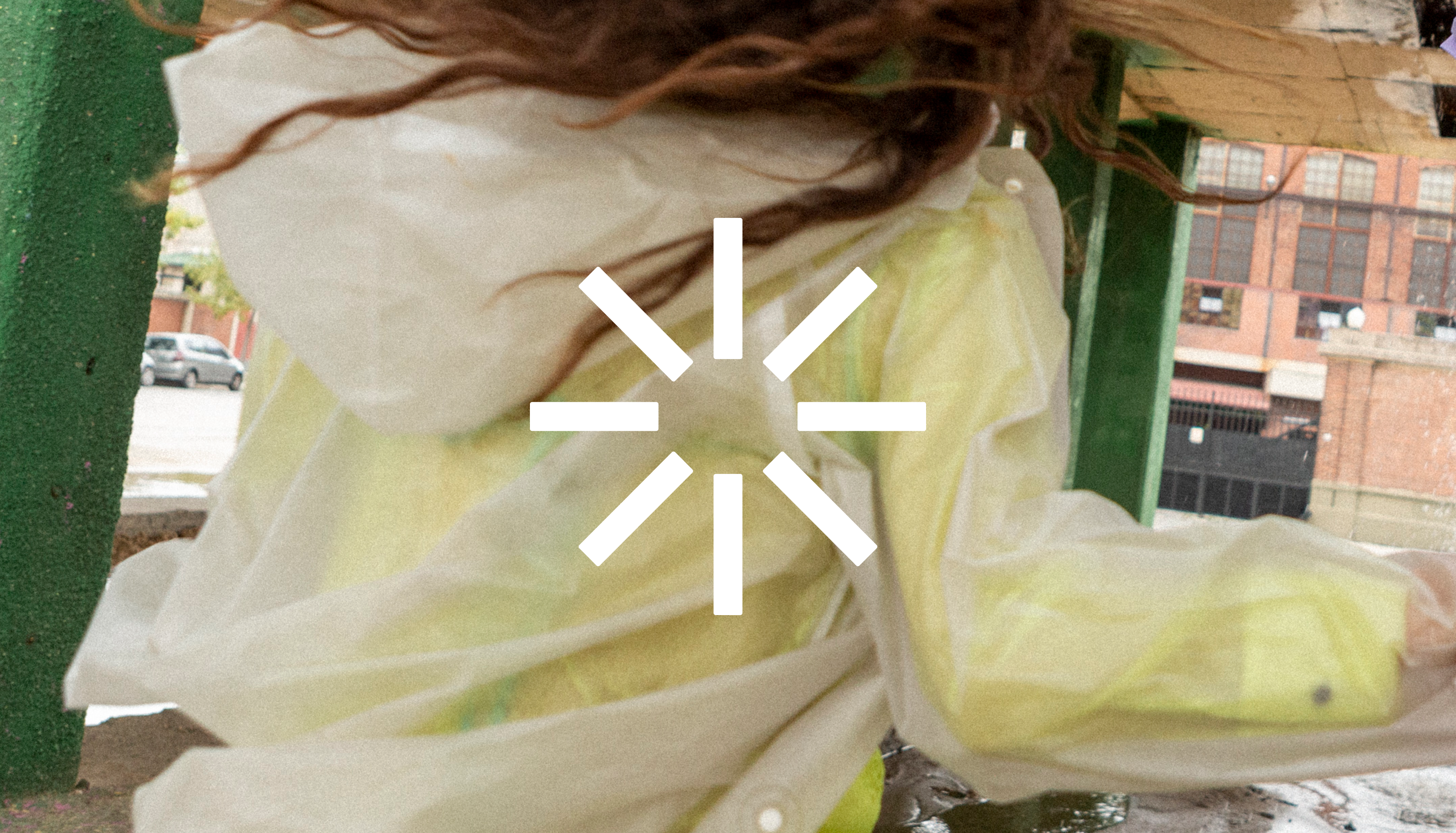
Green Office Co evaluates your business's consumables and provides locally sourced, sustainable alternatives that won’t cost the earth.
We kicked off the process by first researching the competitive landscape, where we uncovered that most players in this space were stuck in 2010 — using cliché cardboard textures and leaves arbitrarily integrated into their logos. With this in mind, we set out to vastly differentiate Green Office Co, empowering them with a no-fuss, irreverent identity system comprised of multiple parts that can be used in combination or independently. Each aspect of the identity is built on the premise that Green Office Co is a brand that doesn't seek to draw attention to itself, but rather serves as a vessel for the products and consumables they believe in. In practice, this led to design outcomes that felt neutral, understated, and devoid of pretense.
The logotype is based on a simple visual intervention in which the word "co" is flipped 90˚ to form the "g". This provides a visual allusion to the concept of "closed-loops" (an important concept in sustainability), while also providing a level of visual simplicity that feels as if the client could have generated it themselves—perfect for the no-fuss nature of the brand. Further leaning into the concept of the identity feeling "self-generated" and unpretentious, we implemented the typeface Univers for its neutrality and "default" systems feel.
Rounding out the core identity elements fresh and distinctive brand colours were selected. This was a rejection of the typical colour conventions of "natural earthy tones" that we uncovered in our competitive landscape research. Instead, we went in the opposite direction; opting for an ultra-bright, artificial colour palette.


